



Explore the key UX principles guiding tomorrow’s digital design and discover how to build intuitive, inclusive, and high‑performance experiences.
User expectations in the digital space are higher than ever. Whether it's a healthcare portal, an e-commerce checkout, or a public service platform, people expect fast, intuitive, and seamless interactions. This is where strong UX principles become essential.
As technologies mature and user needs grow more complex, design decisions must be grounded in clarity, usability, and inclusivity. For teams building a new website or rethinking an existing one, understanding and applying key UX principles is critical to creating meaningful, user-first experiences.
At Convergine, we believe that great digital experiences are built on thoughtful design, technical precision, and an unwavering focus on the user. Here’s a closer look at the core UX principles we follow—and recommend for every forward-thinking digital project.
| Key Takeaways |
|---|
|
1. User-Centric Thinking

User-centric thinking is a cornerstone of effective UX principles. It means designing with the user's needs, goals, and constraints as the starting point for every decision. It prioritizes solving real problems for real people through an understanding of how they behave, what they expect, and where they experience friction.
This principle is foundational in UX because assumptions—especially in complex digital products—can quickly lead to features or flows that don’t work in practice. Instead, user-centric design relies on research: interviews, surveys, usability testing, and behavioral data to inform structure, navigation, and content.
The goal is to align business objectives with user success. When users can accomplish what they came to do—easily and efficiently—they’re more likely to stay, convert, and return.
2. Consistency Across Experiences

Consistency is one of the most powerful UX principles for reducing friction and building trust. When users encounter familiar patterns across pages, platforms, and touchpoints, they spend less time figuring out how things work—and more time engaging with the product.
Consistency applies to visual design (typography, colors, spacing), interaction patterns (buttons, menus, modals), and language (labels, tone, terminology). It also extends to behavior across devices: users should experience the same logic and feedback whether they’re on desktop, mobile, or tablet.
By maintaining consistency, teams support intuitive navigation, reinforce branding, and shorten the learning curve—critical outcomes in any digital experience.
3. Accessibility by Design

Accessibility is a core component of modern UX principles. It ensures that digital products can be used by people of all abilities—including those with visual, auditory, cognitive, or motor impairments.
Designing for accessibility involves more than checking off compliance boxes. It requires thoughtful decisions at every stage: using proper semantic HTML, maintaining sufficient color contrast, enabling keyboard navigation, and ensuring compatibility with assistive technologies like screen readers.
Beyond ethical and legal obligations, accessible design improves usability for everyone. Clearer content, cleaner layouts, and simplified interactions often lead to better overall user experiences—especially in diverse, real-world environments.
Building accessibility into the foundation of your design process supports inclusion and creates interfaces that work better for more people, more of the time.
4. Clear Visual Hierarchy
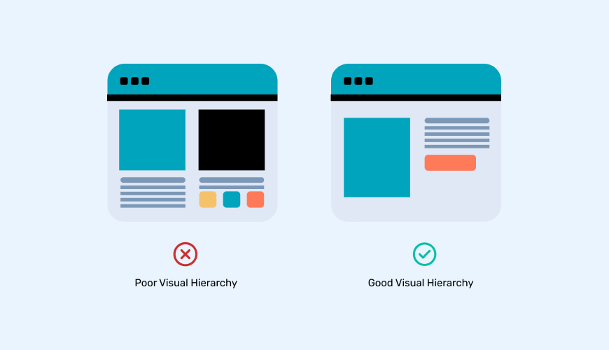
Clear visual hierarchy helps users quickly understand what matters most on a screen. It’s one of the key UX principles that guide how people scan, read, and interact with content.
Hierarchy is established through layout, typography, color, spacing, and alignment. Larger headings, bold type, contrasting colors, and strategic placement all help guide attention. When used well, these elements direct users through a page in a logical, intuitive flow—highlighting actions, surfacing key messages, and minimizing confusion.
Without hierarchy, interfaces feel overwhelming or disorganized. With it, users gain clarity, momentum, and confidence in navigating content and completing tasks.
5. Usability and Performance

Usability and performance are foundational UX principles that determine how easily and efficiently users can interact with a digital product. If an interface is slow, clunky, or confusing, users won’t stick around—no matter how visually appealing it is.
Usability focuses on clarity, simplicity, and task efficiency. A usable design reduces cognitive load, avoids unnecessary complexity, and makes key actions easy to discover and complete. Performance ensures that everything runs smoothly—fast load times, responsive layouts, and minimal delays across devices and browsers.
Together, usability and performance define how well a product supports user goals. When both are addressed with intention, the experience feels seamless, responsive, and satisfying.
Final Thoughts
Designing a digital experience that feels intuitive and responsive doesn’t happen by accident—it requires focus, structure, and a user-first mindset. By grounding your work in core UX principles like user-centric thinking, consistency, accessibility, hierarchy, and usability, you're building with purpose.
These principles don’t just improve interfaces—they shape how people feel when they interact with your product. That trust, clarity, and ease-of-use is what keeps users engaged and coming back.
| Get clarity on your current UX. |
|---|
| Our UX audit identifies usability issues, accessibility gaps, and performance blockers—so you can move forward with confidence. |