
Branding for Roshen Dental Lab
When creating the brand identity and logo for the Roshen Dental Lab, our primary goal was to convey the message of innovation and superior reliability. This was achieved by a careful combination of vivid imagery, the use of revitalized traditional colors and clever logo design.
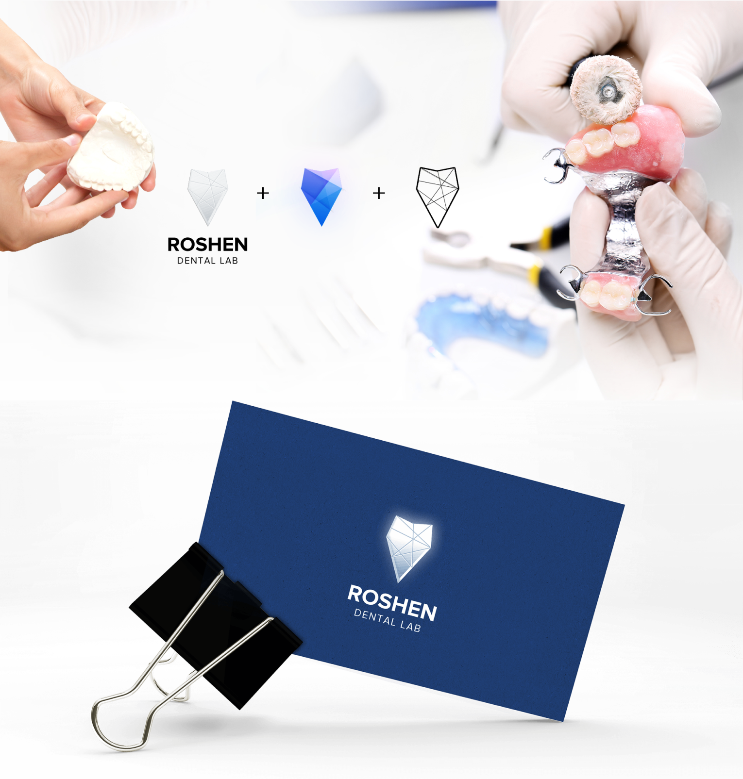
CHALLENGE: THE LOGO AS THE CROWN JEWEL
What would have otherwise been a banal use of a human tooth to indicate a dental brand, was taken to a new level. It was accomplished by morphing the tooth to resemble both a dental implant and a diamond. Additionally, the diamond is stylized in a manner that looks like laser etching, rather than the traditional diamond shape we know from the world of jewelry. The intricate geometrical mesh of this logo adds a hi-tech feel to it, which is an inherent part of the brand.
A UNION OF COLOR AND SHAPE
The typography and color choices were also rooted in tradition while at the same time pushing its limits well into modern, 21st century design. The use of blue and its shades on white and gray backgrounds is done in a way that reinforces the primary message of innovative reliability. The deep ocean blue relays a feeling of calm stability and the teal overtones add gradients and contrasts that resemble LED lights, a symbol of the lab’s innovative approach.
Related projects
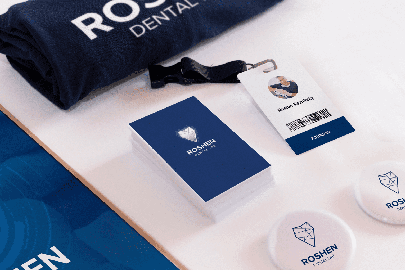
Other work for Roshen Dental Lab

Previous Project
Branding for RentWOW!!!
Next Project
Branding for WOWZLER®
Digital tools to start your journey

Is your website in
good health?
Run a quick diagnostic to uncover issues holding your site back.

How much might it cost to design a website?
Get an instant ballpark estimates based on your goals and features.

Do you need a custom web app or a SaaS platform?
Answer a few questions and get a clear recommendation for your solution.

How much could an outage cost your business?
Calculate the real financial impact of downtime in just seconds.