
Branding for Oakville Dental Arts
Challenge: Rebranding the Dental Office
This logo and brand creation process were unique in the category. The Oakville Dental Arts business aims to provide its clientele with an absolutely different experience than what’s usually expected from a dental office. The atmosphere they create is that of soothing relaxation and wellness, which we did our best to convey in every aspect of the brand’s visuals.
LOGO DESIGN BY CONCEPT FUSION
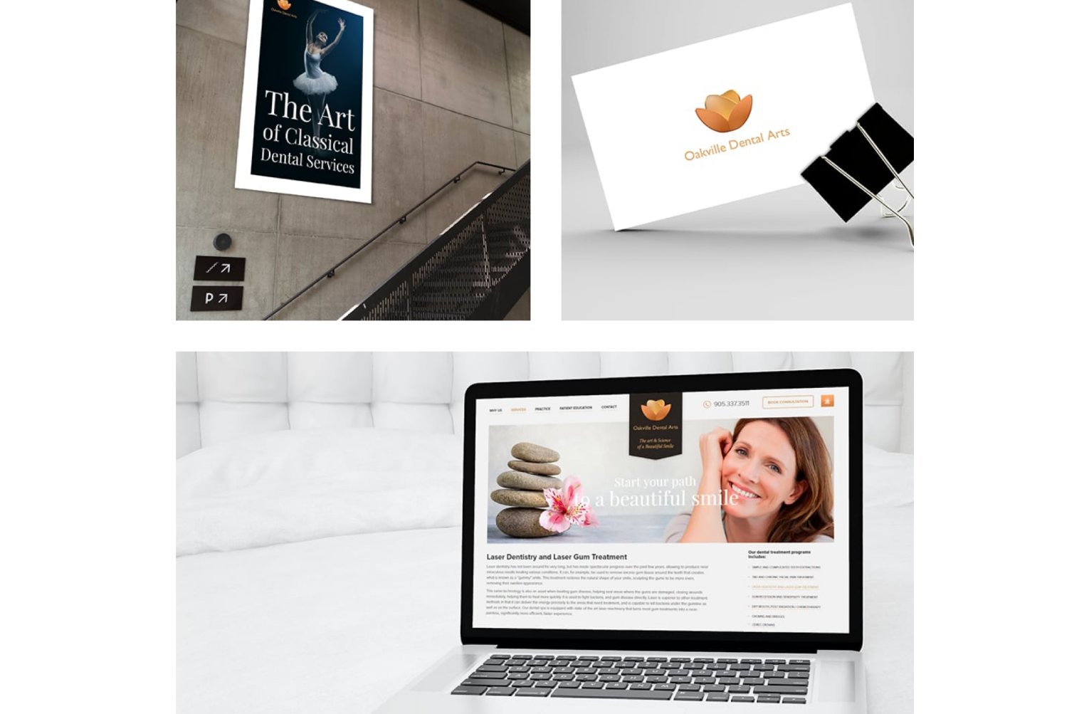
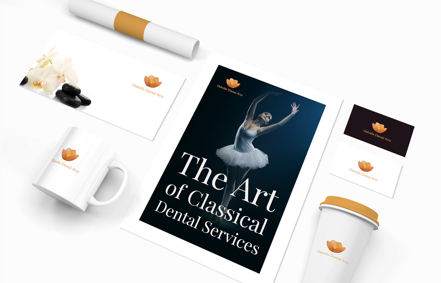
We were tasked with reinventing the dental clinic brand in a new image – the Dental SPA. For this, the traditional symbol of the dental field – the human tooth – was transformed by combining it with two other elements that symbolize the SPA: a hot stone and a lotus blossom. The new logo resembles the lotus blossom the most, while still containing the other two symbols in its heart and essence.
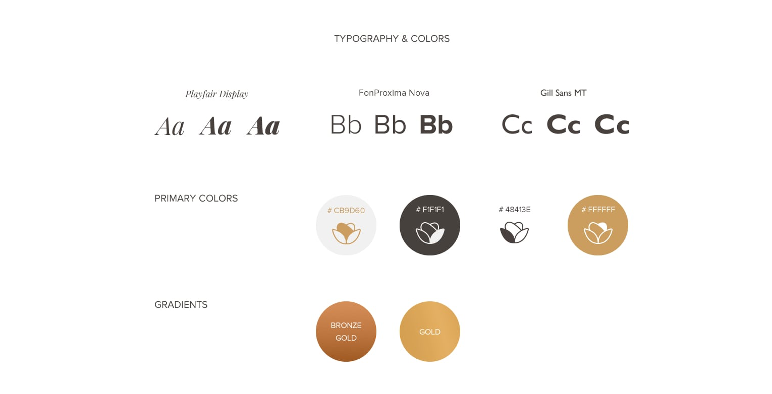
SOFT VISUAL CHOICES
The choice of color palette and typography is also not one would expect from a dental clinic. The primary colors are soft pastel browns and beiges, with the additional gradients of gold and bronze gold, to add to the high-class feel of the brand. The use of cursive in headers and titles further emphasizes this feeling.
FLEXIBLE APPLICATION
The brand colors and logo were carefully chosen to look equally good on any surface and background. They are meant to be displayed on printed materials, such as brochures, business cards, and envelopes, as well as on branded objects like cups and pens.
Let's do something great together!
Related projects
Branding
Website Design
Previous Project
Branding for Mortgage Bee Financial Services
Next Project
Branding for RentWOW!!!
Digital tools to start your journey
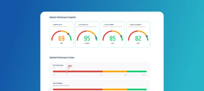
Is your website in
good health?
Run a quick diagnostic to uncover issues holding your site back.
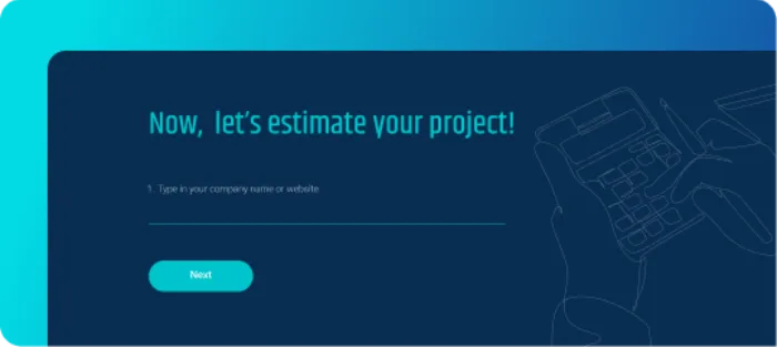
How much might it cost to design a website?
Get an instant ballpark estimates based on your goals and features.
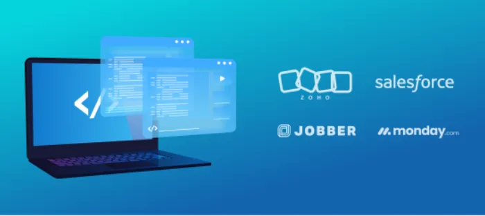
Do you need a custom web app or a SaaS platform?
Answer a few questions and get a clear recommendation for your solution.
How much could an outage cost your business?
Calculate the real financial impact of downtime in just seconds.