


Website Design for Nana Essence
Nana Essence is a perfect example of local Canadian entrepreneurship and of a small business that thinks big. The company was started by a businesswoman who wanted to introduce better, higher quality bath products and make them accessible for everyone. For this, the web design for this brand had to deliver a feeling of down to earth freshness.
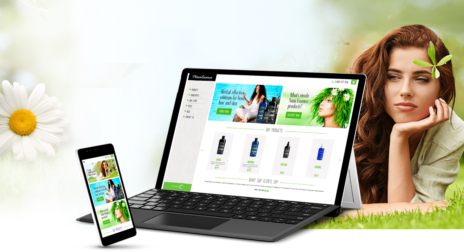
CLEANLINESS AND CLARITY
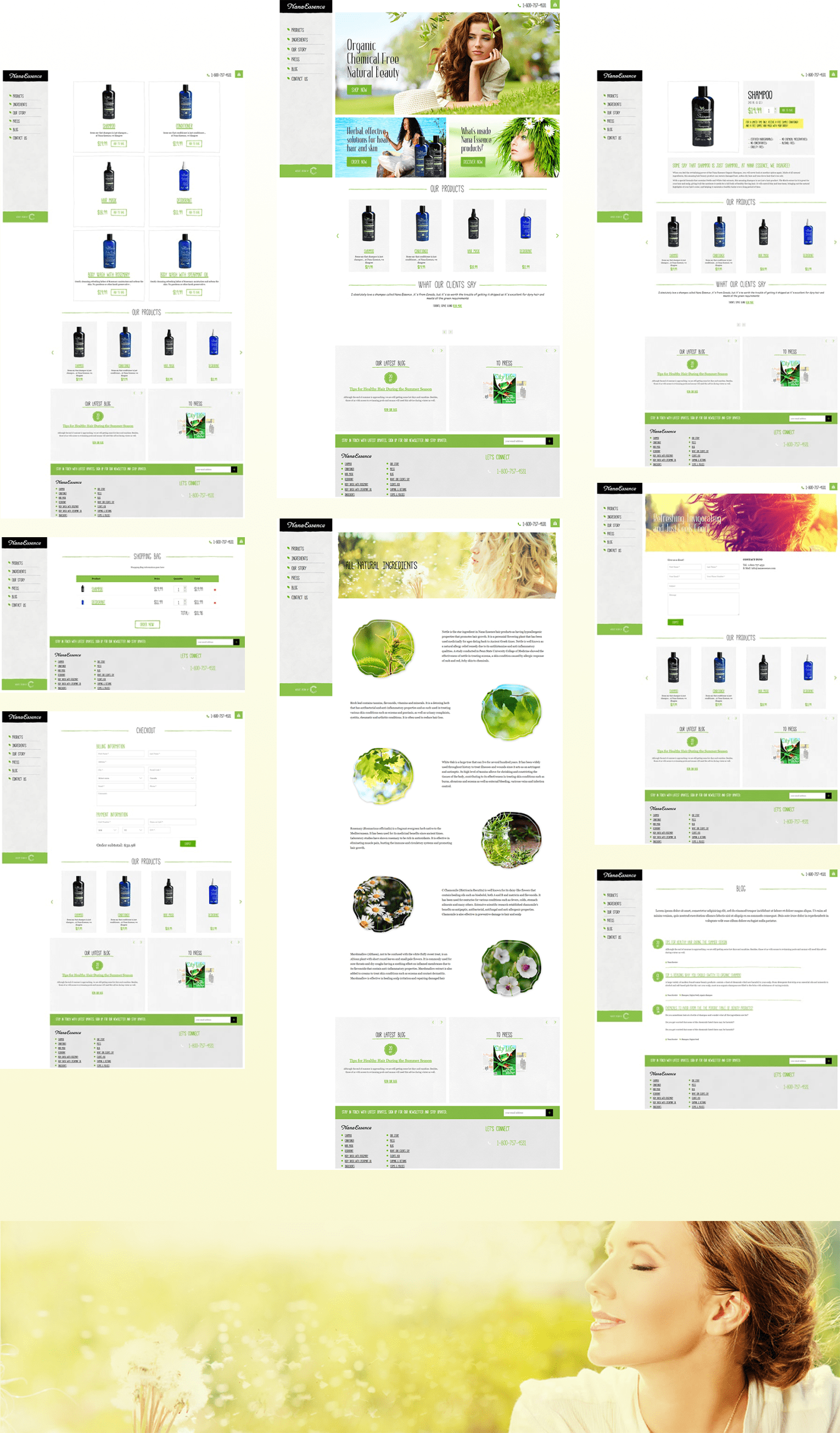
The primary theme of the website is green on white, projecting the feeling of pristine nature at its best. At the same time, this being an online store, the products were very pointedly positioned directly below the main banner so that customers don’t spend time looking for them on the site.
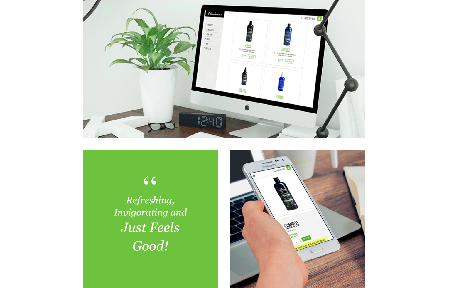

ESSENTIAL SELLING TECHNIQUES
The primary purpose of the website being sales, it has call to action buttons positioned in every banner, inviting visitors to place their orders. A prominent menu is set up on the left side, keeping the users informed of the site’s sections, increasing visitor engagement.
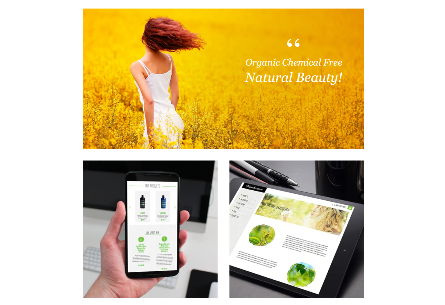
COLOR AND TYPE
The primary site fonts were chosen with the goal of emphasizing this brand as organic and mineral rich, but not for high class buyers only. This sets it aside from elite boutique shops, making it accessible and appealing to a wider range of clients. The font was chosen due to it being friendly in nature, creating an inviting feeling in combination with the primary green hues of the site.
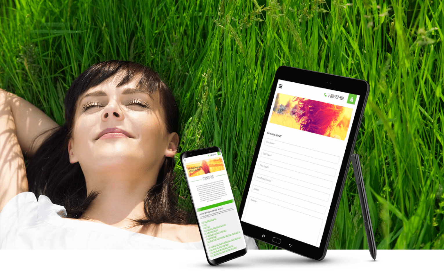
Key pages
Technologies
Previous Project
Website Design for Mortgage Bee
Next Project
Website Design for Nanny Experts
Digital tools to start your journey
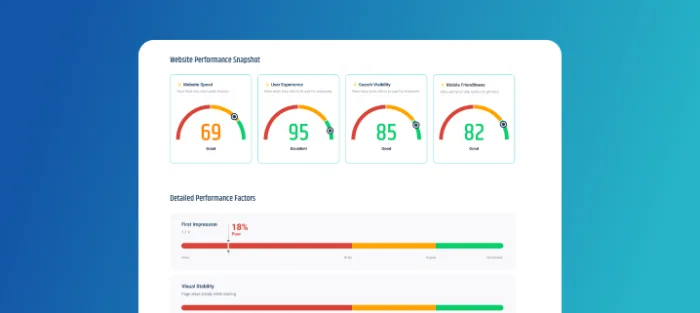
Is your website in
good health?
Run a quick diagnostic to uncover issues holding your site back.

How much might it cost to design a website?
Get an instant ballpark estimates based on your goals and features.

Do you need a custom web app or a SaaS platform?
Answer a few questions and get a clear recommendation for your solution.
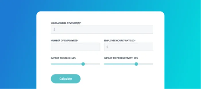
How much could an outage cost your business?
Calculate the real financial impact of downtime in just seconds.