


Quick Summary:
Mobile-first design builds websites starting with mobile devices, then enhances for larger screens. Unlike responsive or mobile-friendly approaches, it prioritizes mobile users from day one - crucial since 60%+ of web traffic comes from phones.
What You'll Learn:
- Key differences between mobile approaches
- Core elements of mobile-first design
- Why mobile-first is the foundation
Mobile internet usage has surpassed desktop, with over 60% of web traffic coming from phones. This fundamental shift demands a complete rethinking of web design—specifically, adopting mobile-first design principles.
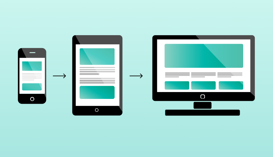
Unlike traditional web development that starts with desktop layouts, mobile-first design begins with the smallest screens and progressively enhances the experience for larger devices.
Designers and developers often encounter three terms: mobile-first design, mobile-friendly design, and responsive design.
While seemingly similar, each represents a distinct approach to handling mobile users. Understanding these differences is crucial for creating effective digital experiences.
TL;DR:
- Mobile-first = start with mobile, build up to desktop
- Mobile-friendly = adapt desktop for mobile
- Responsive = flexible layouts for all devices
- Mobile-first prioritizes performance, content hierarchy, and progressive enhancement
- Essential because 60%+ of traffic is mobile
Understanding the Key Differences
Here's how each approach works:
| Approach | Starting Point | Best For |
| Mobile-First | Mobile screens | New projects, mobile-heavy users |
| Mobile-Friendly | Desktop | Quick fixes for existing sites |
| Responsive | Any screen size | Universal flexibility |
Key Insight:
Mobile-first builds for mobile users first, mobile-friendly adapts afterward, and responsive design tries to fit everyone but may satisfy no one.
Core Elements of Mobile-First Design
1. Content Priority
what does the user need most?
Key considerations for content priority:
- Essential content and features appear first.
- Navigation is streamlined for mobile interaction.
2. Progressive Enhancement
The progressive enhancement process includes:
- Building core functionality for mobile first
- Adding features and content as screen size grows
3. Performance
Critical performance factors:
- Optimized images and assets
- Minimal initial code load
The Bottomline:
These three elements work in harmony to create websites that not only work well on mobile devices but excel across all platforms. The focus on content, progressive enhancement, and performance creates a solid foundation for modern web development.
Conclusion
- essential content
- progressive enhancement and
- solid performance.
Transform Your Website for Today's Mobile Users
Is your website frustrating mobile users? You're not alone. Most businesses struggle with:
- High mobile bounce rates
- Lost sales on mobile devices
- Customers who can't navigate your site on phones
For over 10 years, we've turned these mobile frustrations into business growth—that's why 95% of our clients stay with us.
Let's discuss how mobile-first design can fix your mobile user experience.
Your competitors are going mobile-first. Are you?


