
Branding for Headstart Copywriting
Content has always been one of the main driving forces of internet marketing, and one of the trademarks of good copywriting is clarity and readability. The message should be both condensed and easy to follow. Those were the two main guiding principles when creating the logo and corporate identity for Headstart Copywriting.

GOOD COPY IS WHEN THE PIECES FIT
The logo is based on the company name’s initials H and C, shaped like a book. The final touch in addition to that was to shift the book halves vertically and make them “click” into each other, producing a perfect symbol for a well conveyed thought.
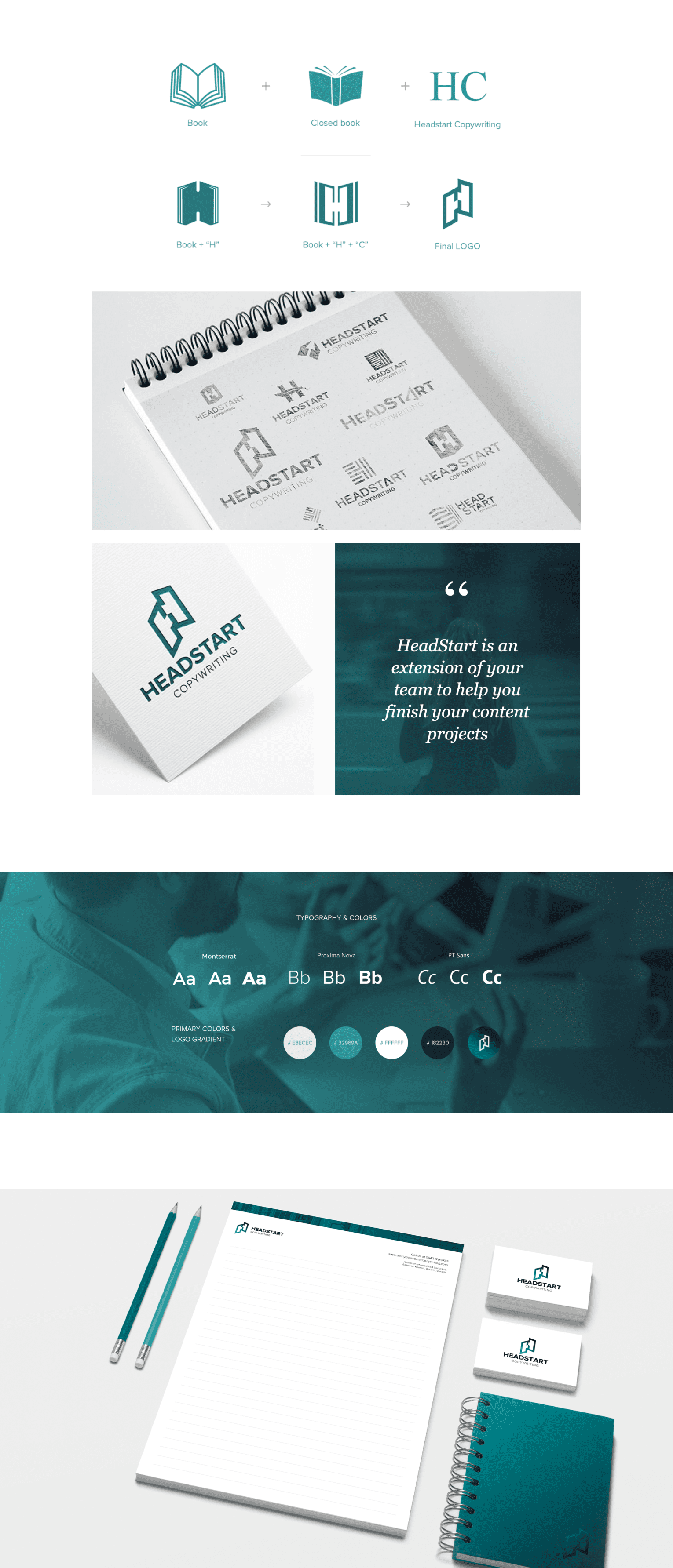
COLOR AND TYPE
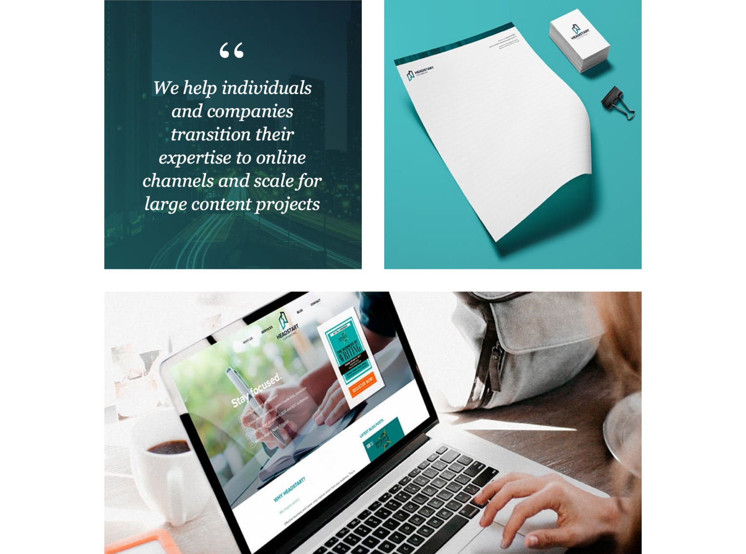
The primary color we chose was a deep aquamarine, which creates a soothing effect allowing readers to focus on the message. Teal is both pleasant to the eye and attracts attention, an advantage for a minimalistic logo that needs to stand out. The typefaces are bold, mostly uppercase, emphasizing the clear and direct content delivery.
Let's do something great together!
Related projects
Other work for HeadStart Copywriting

Services
Previous Project
Branding for Eltek Dental
Next Project
Branding for Ivan Yakovlev
Digital tools to start your journey

Is your website in
good health?
Run a quick diagnostic to uncover issues holding your site back.

How much might it cost to design a website?
Get an instant ballpark estimates based on your goals and features.

Do you need a custom web app or a SaaS platform?
Answer a few questions and get a clear recommendation for your solution.

How much could an outage cost your business?
Calculate the real financial impact of downtime in just seconds.