When it comes to designing a web application, dashboards are one of the final steps in building a web application. Dashboard is an important tool to display metrics that are important to the day-to-day operations of your business then need to be accessed quickly and frequently.
When designed correctly, it can help you and your team quickly monitor, interpret, and analyze what is and isn’t working so you can switch gears if you’re not on the right track. In this post, we will cover the most important components of a data dashboard.
Goals
Choosing what information to track should always be based on three factors:
- The goals of your web application
- The needs of the user
- Which metrics are most relevant for day-to-day operations
Displaying data that doesn’t check all three of those boxes can lead to a confusing dashboard that will overwhelm the people trying to use it. Dashboards are meant to display information that helps you indicate whether your projects and campaigns are on track and highlight any problem areas that users may want to take immediate actions on. If your sales are low for the week or if customer inquiries are going unanswered, you won’t want to wait for a monthly report to uncover and address those issues.
Logical Layout
Metrics are intimidating enough. Laying your data out in an inverted pyramid model allows your team to quickly find and understand the metrics they’re looking for. With this method, you’ll place the most relevant and frequented information up top, followed by progressively more detailed information in the middle and bottom. Using this model, everyone from the managers to administrators can easily understand what’s going on with a quick glance and dig a little deeper only if they need to.
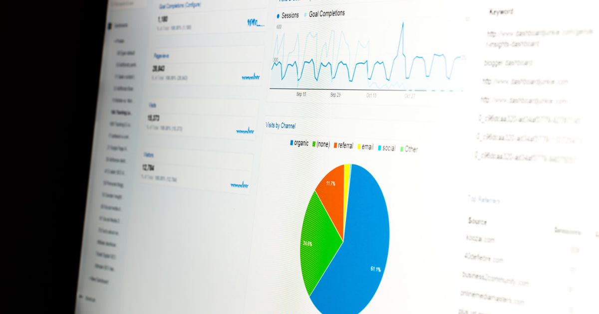
Visualization & Animations

Some metrics are easier to understand when it is presented as an animated bar graph or pie chart. On the same hand, too many visuals or animations can actually make the information seem more confusing. Taking the time to understand what you’re hoping to derive from each measurement and which are best presented as animations, static visuals, or as just plain numbers will lead to a clear dashboard.
Clarity, Consistency & Simplicity
Creating a simple and functional dashboard can be a difficult task. The key to creating a user-friendly dashboard is to display the information in an organized and consistent layout. It is important to group together data that demonstrates related metrics and creates a logical flow and a story. A good dashboard should save a user time to access the right data and not to wonder off looking for related data on your dashboard.
Just like in your car, where the most vital information is visible at a quick glance (speed, gas levels, and engine temperature), the way you organize and display your data should be intuitively placed and clear to understand. If users don’t understand the information they’re looking at, they won’t be able to identify when your project is flashing its “check engine light.”
Colour Choices
Colours not only make your information more visually appealing, but it can actually help users quickly understand what the numbers mean. For instance, you don’t need to read the exact numbers on a chart to know that the red ones are below target and the green ones are doing well. Another way to think about colour is to think about where you will use the numbers. For businesses that regularly update clients, executives, shareholders, and other important audiences on their metrics, incorporating your brand colours into each layout helps support your company identity.
Summing up
Dashboards are effective tools to quickly show relevant data in a simple, visual and intuitive way. Good dashboards can arm you and your team with the actionable data showing results, trends, changes on a daily basis. If you have more questions on the fundamentals of dashboard design or want to discuss your web project, let’s have a conversation.